Poking at geospatial embeddings
If you are on a mobile device or tablet, the interactive components will render as GIFs. While the client-side store I am using to serve the data (IndexedDB) is supported across devices and browsers, the storage limits and eviction policies for that data are more stringent than on non-mobile devices.
Introduction
Google released the weights associated with a geospatial foundation model they developed back in November of 2024 called Population Dynamics Foundation Model (PDFM). At the time I was living and breathing geospatial data. Mostly thinking about flexible ways to represent geospatial data at different levels of resolution, and building out pipelines to ingest data while doing so. So I got excited and downloaded the embeddings. I had been dabbling with vector embeddings, in the process of RAG-building a few months prior, and figured at the very least I could visualize the latent-space they represent.
So I read the paper, but this post and the work that went into it is only partially related to the paper and the embeddings. I will also cover how to serve up a moderately sizable amount of data and cache it using IndexedDB, and will briefly cover what I learned about Nano Stores in Astro. Finally I might even speculate on some downstream use cases for the embeddings.
Paper
I likely came across the blog post announcing the release on Hackernews. It links to a Github repository and a paper.
Takeaways
I can’t do the paper justice by summarizing it myself, but here are some of my main takeaways after having read it:
- They collected and aggregated data loosely falling into 4 different buckets, each aiming to capture a different dimension of ‘population dynamics’
- The graph neural network (GNN) they used allowed them to transfer and calibrate features based on relationships, it also presumably allowed for feature transfer between zipcodes and their corresponding counties (data was collected only at zipcode level, but the resulting embeddings cover both zipcodes and counties)
- The embeddings architecture (330-dimensional vectors for each zipcode and county) was engineered in so that the embedding dimensions are partitioned by data source (4 buckets: aggregated search trends, busyness, maps, weather & air quality). However the self-supervised model basically learned to represent the data in a more compressed way, collapsing busyness and maps into a single category. What is nice about this ‘disentangled architecture’ is that we can analyze / use different slices of embeddings on their own, as we’ll see in some visualizations below.
- One way we can understand these embeddings is as a compressed representation of all the data that was used to train the model.
- These embeddings can be used to basically fine-tune downstream models across a range of tasks relating to interpolation, extrapolation, and superesolution (interpolation = filling in the gaps, extrapolation = predicting beyond the data, and superesolution = higher resolution predictions from lower resolution data).
How do we use it?
The image below (snagged from the paper) answers the question: “What do we do with this model/ these embeddings?”
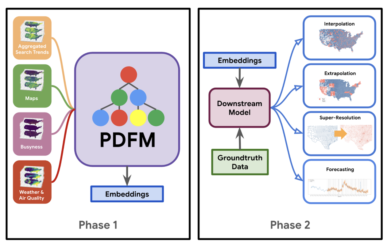
In a nutshell (per the diagram) Google’s done the work of training the foundation model and publishing the resulting embeddings. Downstream usage mostly involves training our own models using datasets (including ground truth data) containing zipcode (or county) labels, and using the embeddings to improve the quality of our model. Turns out that is the purpose of a foundation model: to provide a strong base from which related downstream (lighter/smaller) models can be trained at a fraction of the time/cost.
Our results show that a foundation model with a rich and diverse set of datasets can broadly model a wide range of problems. Individually, signals like aggregated search trends perform best for predicting physical inactivity, while maps perform best at predicting night lights or population density, even surpassing remote sensing signals. However, combining multiple signals into one foundation model outperforms all individual signals. This unlocks the potential for our architecture to easily incorporate new signals and be applied to new domains and downstream tasks without having to hand craft features or design new model architectures. -Google Research
Embeddings
Maybe now’s the time to mention that this foundation model is trained on data from the continental United States only.
The downloaded data includes the following:
- zcta_embeddings.csv - embeddings for zipcode tabulation areas
- zcta.geojson - geojson for zipcode tabulation areas
- county_embeddings.csv - embeddings for counties
- county.geojson - geojson for counties
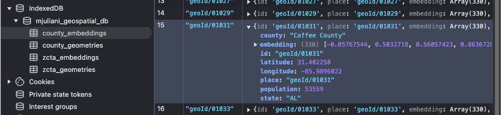
The embeddings files basically include a 330-dimensional vector for each zipcode / county, and the geojson files include the boundary representations (polygon/ multi-polygon). As mentioned above, the resulting embeddings are partitioned by bucket into these categories:
- 0 - 127 Aggregated Search trends
- 128 - 255 Maps & Busyness
- 256 - 329 Weather & Air Quality
Analyzing embeddings?
Looking at arbitrary weights in a neural network would be hard- the weights don’t have semantic meaning. However these embeddings are sort of split along semantic categories. They are designed to be interpretable and they are tied back to direct geographic locations. This interpretability built into the embedding architecture allows them to test how different embedding components perform on different prediction tasks.
Below, we’re going to run a few common operations to visualize vectors and their similarities: calculate the cosine similarity between them, and run Principal Component Analysis (PCA) to reduce the dimensionality of the data and be able to see the data in 2D.
Cosine Similarity
Cosine similarity is used to measure the similarity between two or more vectors. Often it is used to compare the similarity between documents. In the retrieval phase of RAG, it is used to measure the similarity between the user query (embeddings) and the chunk of text (embeddings) stored in the database. By wrapping it in a method like the one below, we can run cosine similarity, given a target vector, against the entire vector space, or we can slice by the aforementioned embedding categories.
function findSimilarCounties(
  targetCounty: string,
  aspect:
    | 'all'
    | 'search'
    | 'maps'
    | 'environmental' = 'all',
  n: number = 5,
): Array<[string, number]> {
  const targetIdx = this.countyToIdx.get(targetCounty)!;
  let relevantEmbeddings: number[][];
  if (aspect === 'all') {
    relevantEmbeddings = this.embeddings;
  } else {
    const [start, end] =
      CountySimilaritySearch.CATEGORIES[aspect].range;
    relevantEmbeddings = this.embeddings.map((emb) =>
      emb.slice(start, end),
    );
  }

  const similarities = this.computeCosineSimilarities(
    relevantEmbeddings[targetIdx],
    relevantEmbeddings,
  );

  return this.getTopN(similarities, n, targetIdx);
}
Type in the county of your choosing into the search bar, you should be able to see the top K closest counties, given the features you want to compare by.
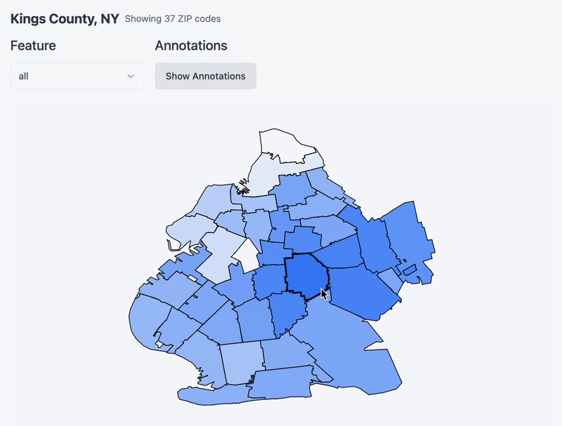
Now that you’ve chosen a county, see below a map of the county and its constituent zip code tabulation areas. Hover over a zipcode to set it as a ‘target’ and notice a heatmap emerge around it. I am re-running cosine similarity between it and the rest of the zips in the county (and whatever feature you specify via the dropdown!). One thing to note is that I remapped the values to be between 0 and 1 for effect. Without remapping it turns out that the cosine similarity between zipcodes in the same county is very similar. Remapping accentuates the differences a bit and makes for a more exciting chart.
(temporarily showing this gif, this interaction is currently broken)
PCA
Another technique that is often used to reduce the dimensionality of high dimensional data into an arbitrary dimensions is Principal Component Analysis (PCA). In this case, we want to map the data down to a 2D plane using the first two principal components. These components are chosen because they capture the directions of maximum variance in the dataset. Using K-means clustering, we can start to see how the data is clustered on a 2D plane, as well as on the map of the US. Notice that when we filter by feature, we are getting a different PCA projection in 2D, this is because we are rerunning PCA on the embedding slice corresponding to said feature.
Notice that the entire US map isn’t covered in points - this highlights the coverage described in the paper: not all counties are covered. Below (from my ‘loading’ logs) we can notice there are more geometry polygons provided in the dataset than there are vectors - not sure why.
Serving the data
I could have run the analysis locally, and served static images on this post in lieu of interactive charts. However part of what makes data exciting is being able to interact with it. For that reason, it would be worth the effort to serve the data.
GCS
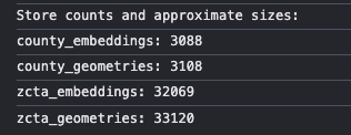
There were ~36k vector embeddings (330 dimensions each), and another ~36k polygons (33k and 3k respectively), deploying the csv and geojson files directly would not have been feasible. I opted for putting the 4 files in a GCS cloud bucket, and setting CORS on that bucket to only accept read requests from my blog post url.
IndexedDB
After getting that set up, the more important part was figuring out where to store the data, to avoid hitting the cloud bucket unnecessarily, and also to avoid storing everything in memory once fetched. IndexedDB is a good choice as it allows for large amounts for structured data to be stored and indexed. The storage limits and eviction policies vary per browser, but this stack overflow post suggests that the global storage limit can range from 10MB to 2GB. I’d used it before and it is straightforward to implement. I set up 4 stores (each corresponding to each of the files) under a single DB.
While we still need to load the entire county dataset into memory for operations like PCA and Cosine Similarity, IndexedDB proves particularly useful when fetching geometry and embeddings for zips corresponding to a target county.
Below you can see the actual disk space the data is taking up on your machine. Also, there’s a toggle for you to set to keep / clear the cached data from IndexedDB. I selfishly set it to keep by default so that if you reread the post, you don’t have to do the round trip to GCS. However feel free to set it to clear and when you close the tab, the db should be wiped.
Chunking
When saving the data to IndexedDB (async), I noticed that a number of rows were being dropped for no reason. Eventually it seemed to be some sort of timeout on the save operation, after all there were a lot of entries being fetched and then saved all at once. Fortunately, chunking the data for the ‘save/set’ operation per the snippet below resolved the issue.
function chunkArray<T>(array: T[], size: number): T[][] {
  const chunks: T[][] = [];
  for (let i = 0; i < array.length; i += size) {
    chunks.push(array.slice(i, i + size));
  }
  return chunks;
}

const chunkedData = {
  countyGeometries: chunkArray(
    countyGeometryRecords,
    CHUNK_SIZE,
  ),
  countyEmbeddings: chunkArray(
    countyEmbeddingRecords,
    CHUNK_SIZE,
  ),
  zipGeometries: chunkArray(zipGeometryRecords, CHUNK_SIZE),
  zipEmbeddings: chunkArray(
    zipEmbeddingRecords,
    CHUNK_SIZE,
  ),
};

for (const [storeName, chunks] of Object.entries(
  chunkedData,
)) {
  for (let i = 0; i < chunks.length; i++) {
    const chunk = chunks[i];
    const store = storeName.startsWith('county')
      ? storeName.includes('Geometries')
        ? geometriesStore
        : embeddingsStore
      : storeName.includes('Geometries')
      ? zipGeometriesStore
      : zipEmbeddingsStore;

    await Promise.all(
      chunk.map((record) =>
        store.set(record.place, record),
      ),
    );
  }
}
Nano Stores
I was aware that Astro was fast as it mostly serves static content, while allowing for ‘islands of interactivity’. Turns out this means using (react) context providers is not a valid pattern. They recommend using the Nano Stores library for sharing state. It works as a sort of singleton for each store you want to set up, you can spin up as many as you want as you would contexts.
For this blogpost, I basically set up 2 stores: one to handle data loading, and one to handle the selection state. The first one allows client components to selectively render data-intensive/interactive content or not.
const { isMobile, isLoading, error, progress, data } =
  useStore(dataLoadingStore);
The second store handles the selection state, which enables us to store the target county, as well as what active feature is being looked at. You may have noticed: in the interactive components above, if you change feature or county, that state tracks across components. This made it easier to decouple individual components, while pointing at the same data.
const { targetCounty, activeFeature } =
  useStore(selectionStore);
Conclusion
The above visualizations are pretty common for visualizing and comparing multi-dimensional data. The clustering patterns may confirm our intuitions, but they become powerful tools when combined with targeted investigations. Next steps: browse some zipcode/ county datasets, find an interesting question that can be answered ‘if only the data was fully available’. These embeddings are a promising tool to fill in some of those gaps. While writing this, I came across this Carto blog post which points to the pitfalls of using zipcode areas as a spatial unit of analysis. It seems that despite the drawbacks, it is a common enough reference for Google to have used it as the index in their population dynamics foundation model.